Monday 30 September 2013

Parallel and Contrapuntal sound presentation feedback. (Mr.Halsey)


Presentation song :
 Beyonce -
 Dangerously In Love.

Mr Halseys feedback:

WWW: 
- great choice of images, nice mix and background.
- contrapuntal images got the reaction.
EBI:
-Would the presentation be better without Royal family
-Design and layout of slides could have been better.


My feedback:

WWW:
-I had a variety of images
-The animated pictures were a nice diversification
EBI:
-The royal family couple didn't fit in with the Beyonce soundtrack, another acting/sings couple e.g Will Smith & Jada Pinkett Smith.

Monday 23 September 2013

3 Types of Reading [news source] & Hall's theory - Mr.Bush

Stuart Hall's theory of Encoding & Decoding
The theory claims that the audiences of Media will interpret messages in a different manner depending on their culture, economic standing, religion as well as personal experience. Hall's model claims that everyone will decode in different ways.

According to Hall, the one decoding can assume three different readings :
-> Dominant

->Negotiated
->Oppositional

NEWS SOURCE - Terror in Nairobi, Kenya

 (Militants inside Westgate Shopping Centre have threatened to kill the remaining hostages as Kenyan security personnel try to end the             siege (pictured)    Taken from : Daily Mail

-> Dominant reading: Someone who lives possibly in the western society and has been brought up there as well as those who are well educated and want the people in Kenya massacre to be saved - will be likely to respond positively to this image and give the 'preferred response' to the creator. This dominant reader will feel that the Kenyan security personnel are really ''trying'' to save the ''remaining hostages''. 

-> Negotiated reading: This will be the reading of someone whose personal view and the creators intentions are merged. The negotiated reader could feel that the ''Kenyan security personnel'' are trying to help, however they may think a step further and think that the security in Kenya aren't trying hard enough. 

-> Oppositional reading: An oppositional reader will feel that the security aren't ''trying'' and will completely disagree with creator and say that the security are useless and not doing enough.

Sunday 22 September 2013

Analysis - Human Print advert - Mr.Bush


Human print advert : Wonderstruck perfume advert

Colour - The colours used in the ad are mostly bright and feminine colours. The pink is used for the framing and Taylor swift's dress. Pink connotes femininity and admiration. This means that audience will have the perfume  'wonderstuck' seen as a feminine perfume, that is admired. In addition Silver is used for the sequins on Taylor's dress and the chandeliers. Silver gives Taylor a princess look and adds glamour and femininity - once again, this adds to the influence the pink had on the audience. Gold is used for the copy as well as the lid on the product itself. 
The gold suggests that the product is luxurious and is full of quality. The effect of the colour in the advert has multiplied as it is also a part of product, so the connotations will directly be related to the product. The bottle of the wonderstruck is purple, this is the brightest colour in the advert making it one of the key focuses. The colour purple is chosen to make the audience feel like the perfume is up to  royalty standard, and therefore is unique. The colour purple also adds to the elegance of the antique style copper gold lid, and is a great contrast, attracting the audience further. 
The greenery in the background enhances the brightness of the advert, in addition greenery as the background makes the audience feel that Taylor is natural and free. This will allow them to think that the perfume will make them more natural as well as giving them more freedom.

Shot type - Taylor Swift has been photographed at a medium shot in order to have a neutral focus on the celebrity, although the product is 'hers' they didn't use a close-up as that would look too personal and bring too much attention of Taylor Swift. In addition they wanted a little more of the costume to show as it is used for a feminine effect. 

Subject holder - The person that is photographed is Taylor Swift, she's relevant to this advert as the perfume is of her own brand. The perfume is the product advertised therefore a picture is also provided on the foreground of the advert. 

Composition - The photograph of Taylor Swift has central position however the product is placed towards the bottom right of the advert. The copy is on the left side of the product, allowing the audience to view the product straight after the description of it, as the mind read from left to right. 

Lighting - High-key lighting has been used to give the advert a more realistic and natural look. the natural look was given to keep the atmosphere calm and feminine and not too dark. 

Framing - The advert is framed using a hot pink blunt line, this makes the advert as a whole stand out.

Size - Taylor Swift is the largest subject in the advert, this attracts attention as she is a celebrity, and seeing her will instantly get the audience wanting to know more. The bottle of perfume is approximately 1/3 of the size of Taylor Swift, this is to show the audience the actual product, so the purpose of the advert is more clear, even without reading it. 

Pose - There is a faint smile on Taylor Swift's face, this is so the advert doesn't look too cheesy and doesn't get too much attention on her. The arm that is near to the perfume is hiding behind her dress so that the perfume has the background of her pink dress, as that would be a good contrast, not her arm. 

Setting - The advert is set in a private garden or park, this is noticeable as there is greenery in the background. The setting looks exquisite and unique this is due to the chandeliers which give a royal look to the entire advert. The chandeliers are used in the background so the audience start to feel that owning 'wonderstruck' will make them 'royal' and 'unique'. 

Mise en scene - Image analysis


Movie poster(Image) - Skyfall


Costume -  The star wears a silky navy suit with a white shirt and a black bow. This gives the character a very classy look and suggests that the movie will have some form of formality in it. The combination of the dark suit on the white shirt suggests that the character has some form of purity to him, as white connotes innocence. However the suggestion of purity is then contradicted by the darker colours, that connote authority, crime and mystery.

Lighting - Low key lighting is used with a key light on the gun and a back light from the back left. The low-key lighting creates a contract of lighting and a shadow on half of the the actors face, this makes the actor look dramatic and mysterious. 

Actors facial expression and body language - Daniel Craig is the star of Skyfall  Daniels facial expression are very blunt and serious. This suggests the character has a very important role. His body language is very bold and stiff, this adds to his serious facial expressions. The body language suggests that he is aware and ready, and as he is holding a gun there is a possibility that he's 'ready' for a mission.   


Props - The props used is a gun, the gun is held in a position which a gun would be held at just before aiming. This suggests that Daniel Craig  will be related in Crime and action, this also gives away the genre - Action, Crime, Mystery. 

Setting - The background is mainly black and has a white feather-looking swirl merged in with the black. The white 'swirl' contains a building which is in monochrome. The black background connotes conservation, which then also allows the audience to understand Daniel's serious facial expressions and his dark coloured clothing. The building in the background looks archaic and ancient, and therefore represents that there is some relation to history in the movie. In addition the picture of the building is smaller than the actor and is below and behind Daniel Craig, this suggests that he has relation with the building.   

Position of character - Daniel Craig is placed in the middle of the poster in order for the audience to give him the most attention as he is the main actor. 


Friday 20 September 2013

Mr Bush - iPhone 5C - Key concept analysis


new


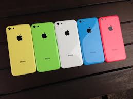
Apple are launching their new product named ''iPhone 5C''. The iPhone 5C is the first Apple mobile that is available in 5 bright different colours.

The iPhone 5C has a style which is more appealing to a younger audience. This is due to the variety of bright colours as well as the use of lighter weighted plastic for the exterior. The curving structure also adds to he appeal to the younger audience. 

The mobile has the new ios7 operating system allowing previous Apple products to be using a upgraded version of a product they are familiar with. In addition the ios7 is less complicated allowing new customers of Apple to adjust to the system easily

The mobile is shown by a step by step process which allows the audience to understand exactly how the product is made. In addition after the making process has ended, the iPhone 5C is shown in a girl's hand who was taking pictures of her friends and was shown to be really joyful and giggly as she held the new iPhone 5C, this allowed the audience to believe that the mobile on its own connects people and brings them together. This also allows the audience to be in the place of the model in the ad - as they want to be happy too. 

Apple decided to have soft music playing in the background  this made the audience feel more comfortable and relaxed about the iPhone 5C. The audience will also feel that the iPhone 5C will make them feel more relaxed and bring them comfort. The audience are then assured on comfort by Apple choosing to show in the ad all the process's of the actual mobile, for example: use of apps such as games and facetime. This allows audience to understand how easy it really is to use this mobile. 

Tuesday 10 September 2013

Why I chose Media Studies for A-Level.


Why media?

I was always told by my brother that doing Media at Greenford 6th Form is one of the best choices he had made. Suggestions of doing media at A-Level then continued... Sometimes by my family, friends, and even my English teacher, Miss Rumblelow.

Over the course of my GCSE English I was taught by an amazing teacher. She taught both English and Media, however my high school did not offer Media Studies at GCSE level, so unfortunately I wasn't able to do Media earlier in life.

During our English 'speaking and listening' the debates would often be media related and I would love every moment of it... Media also compliments well with my future career as a teacher, as well as Business which is my other option at A-Level.

I want myself to not be caught up in the propaganda of media. I want myself to be able to use my own brain regarding issues and the way media portray situations and people.

My English teacher has been telling me for 2 years that I will do great in Media, and she has made me believe in myself, so here I am.. At a new environment, with new teachers and people to prove myself right.